
TEST STRIP
v2.0
DCTL
SEEING IS DECIDING
COMPARE GRADES
WITH TEST STRIPS
Judging an image in isolation is difficult. Without a direct reference, it’s hard to know whether the image is too dark, too flat, or oversaturated. Side-by-side comparison reveals subtle differences instantly.
Scopes like the waveform or vectorscope provide numerical feedback but lack visual context. The Test Strip DCTL solves this by displaying multiple grading variations simultaneously, allowing precise visual evaluation of exposure, contrast, and saturation.
Inspired by the traditional test strips of photography, this tool applies the same practical approach directly to digital color grading.
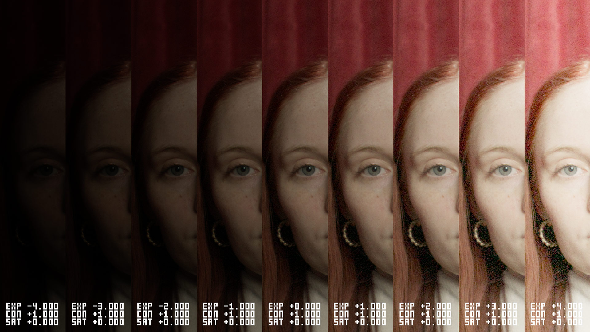

EXPOSURE
Visualize incremental exposure adjustments from underexposed shadows to overexposed highlights. Quickly assess how brightness affects overall detail, clarity, and tonality.
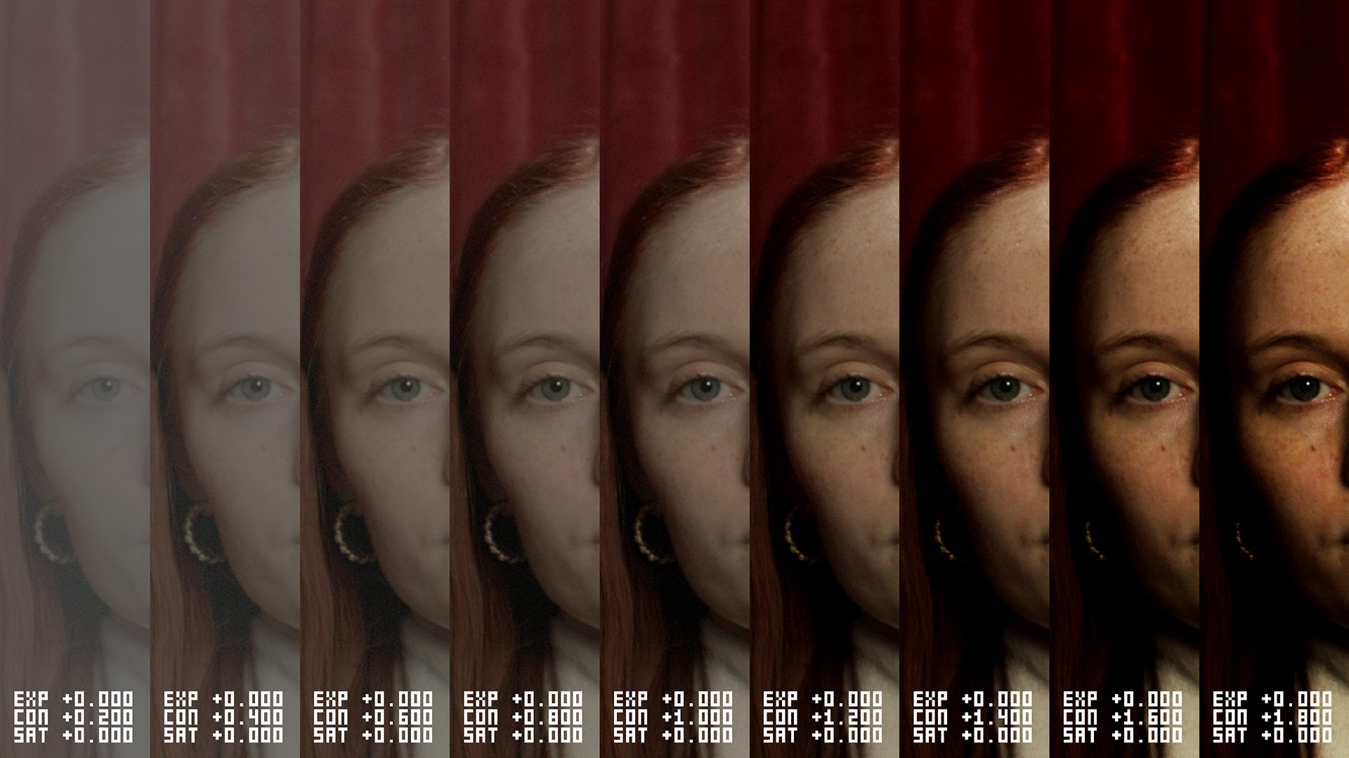
CONTRAST
Evaluate how contrast variations shape image depth. Lower contrast results in softer tones and subtle gradations; higher contrast enhances definition, drama, and visual impact.
SATURATION
Observe color saturation changes clearly and precisely. From muted or monochromatic tones to vibrant, richly saturated hues – immediately identify the ideal intensity for your image.
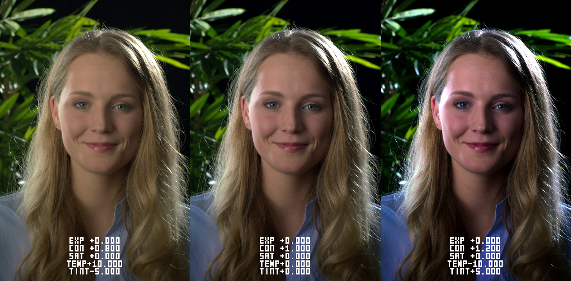
LEFT FRAME
The image has a warm and slightly soft feel, with a noticeable yellowish-green cast that gives the skin a less natural tone. The contrast is gentle, resulting in a more diffused, mellow appearance, which feels calm but slightly flat and stylized.
MIDDLE FRAME
This frame appears neutral and well-balanced, with natural-looking skin tones, clean whites, and even contrast. It feels true-to-life and unaltered, serving as a strong baseline or reference look that maintains realism and visual clarity.
RIGHT FRAME
The image has a cool, high-contrast look with a magenta tint that creates a more dramatic and stylized atmosphere. Skin tones lean toward pink and blue, and shadows are deeper, making the image feel punchy, intense, and more cinematic.
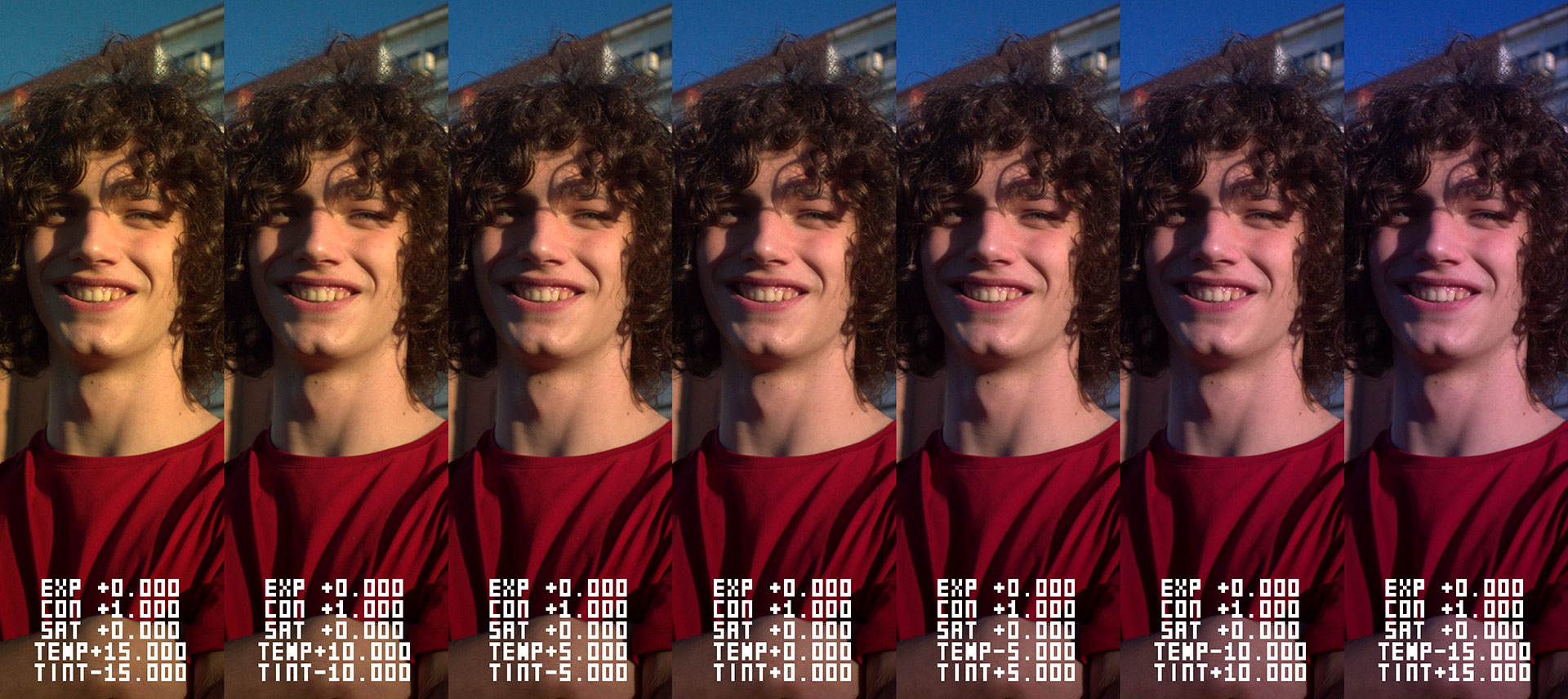
This seven-way split shows how temperature and tint shifts affect the image. The far left is very warm and green, making skin look muddy and unnatural. As you move toward the center, the tones become more balanced, with the middle frame appearing neutral and natural. Further right, the image turns cooler and more magenta, giving skin a pinkish, stylized look. The progression clearly demonstrates how subtle changes in white balance can dramatically alter mood and realism.
TEST STRIP DCTL
Number of Splits: Set how many image segments to display.
Split Mode: Activates split view to compare variations.
Split Full Frame: Applies each variation to the entire image.
Exposure +0.5 Stop / +1.0 Stop: Increase exposure per split.
Exposure Flip: Inverts direction (decrease per split).
Contrast +0.100 / +0.200: Incrementally increase contrast.
Contrast Flip: Makes contrast decrease per step.
Saturation +0.100 / +0.200: Increase saturation in each split.
Saturation Flip: Apply decreasing saturation instead.
Temp +5 / +10: Warmer image per split.
Temp Flip: Cooler image per split.
Tint +5 / +10: Shift toward green.
Tint Flip: Shift in opposite direction (magenta).
Monochrome: Converts image to black & white.
Show Values: Displays numerical values for each split.
THE FASTEST WAY TO
EVALUATE A GRADE
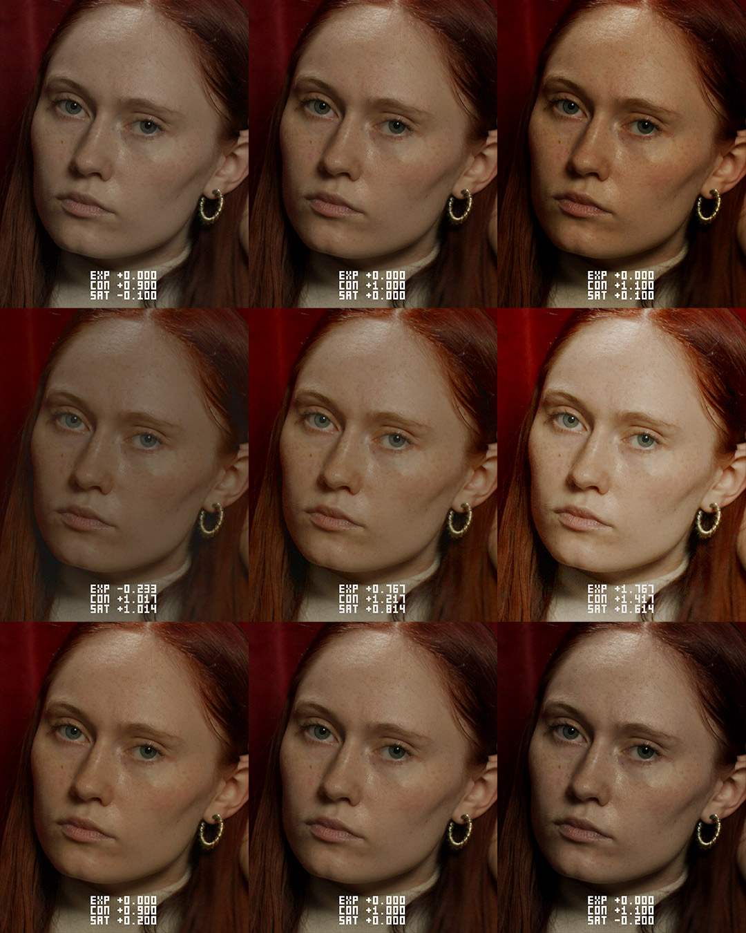
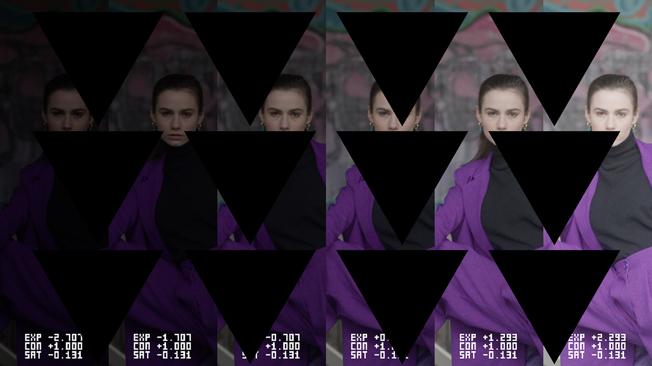
By displaying these variations side by side, this Test Strip DCTL provides an instant comparison, helping to quickly evaluate the impact of different contrast and saturation settings. Instead of adjusting values one by one and switching between versions, this approach streamlines the decision-making process, making grading more intuitive and efficient.
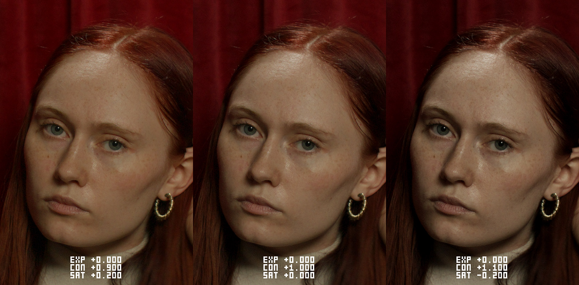
The left set of three images presents a progression where contrast and saturation are adjusted from left to right. Contrast increases gradually across the frame, starting at +0.900, then +1.000, and reaching +1.100. At the same time, saturation decreases from +0.200 to 0.000, and finally to -0.200, creating a shift from a warmer, more saturated look to a cooler, more subdued one.
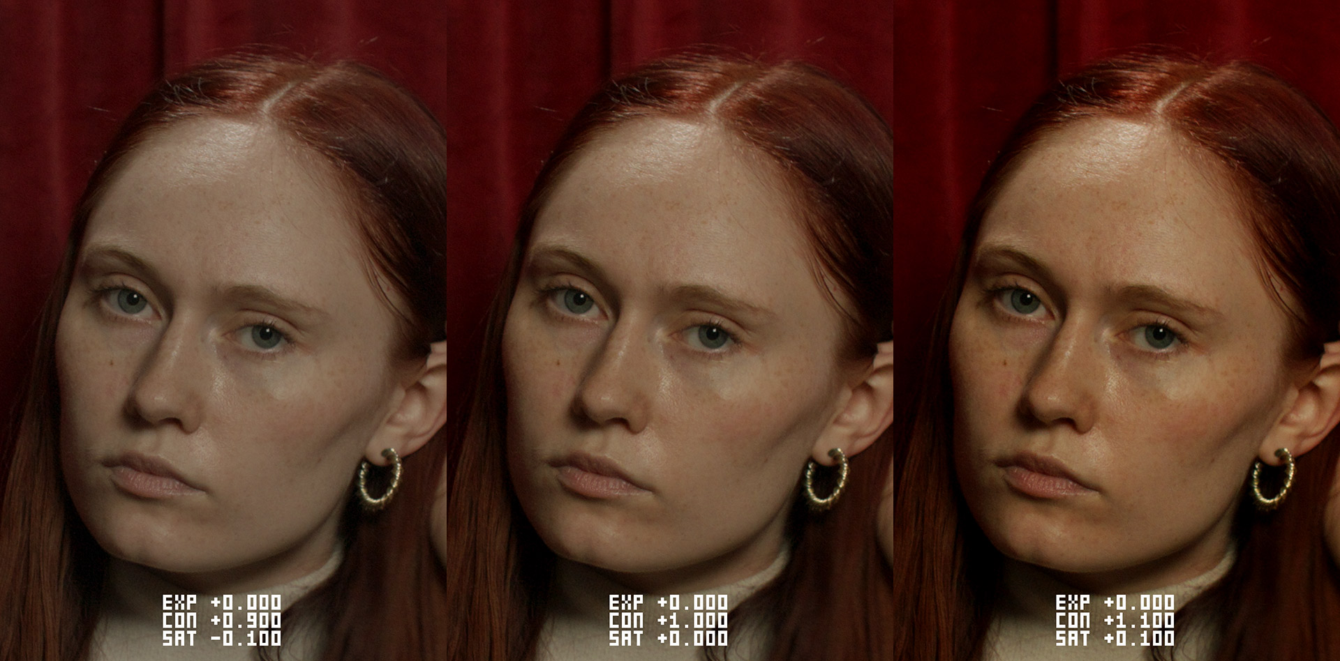
The right set also shows a progression in contrast and saturation from left to right. Contrast again increases from +0.900 to +1.000, and then to +1.100. However, unlike the left set, saturation moves upward from -0.100 to 0.000, and finally to +0.100 — resulting in a transition from a slightly desaturated look to a richer, more vibrant one.
With just a couple of clicks, you can combine and flip contrast, saturation, and exposure values to generate quick, structured look comparisons — perfect for look development and presenting options to clients.
VIDEO
FREE DEMO
ko-fi.com / 100 KB
This version includes a watermark, displayed as a grid of black triangle shapes
on the image. The demo version is ideal for users who want to explore
the software’s features and functionalities before making a purchase.
BUY
-
 € 99,00
incl. 19% VAT