
COLOR SHIFT
v4.0
LOOK DEVELOPMENT TOOL
INTRODUCTION
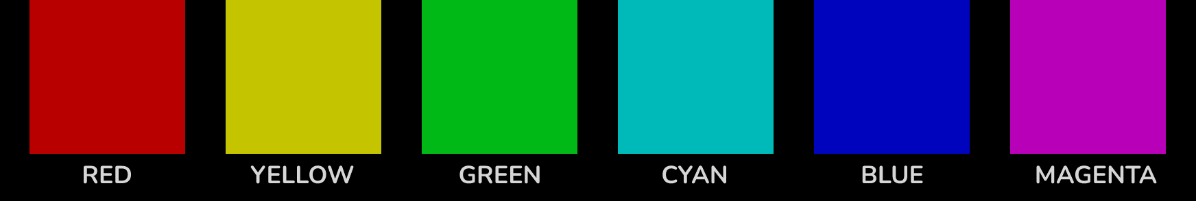
I drew inspiration from FilmLight’s Baselight ‘Hue Shift’ tool, which offers the innovative capability to shift hues towards adjacent colors. Following this initial adjustment, you can enhance the image further by increasing saturation, adjusting brightness, or desaturating specific hues. It focuses exclusively on the six main colors and is therefore very reduced and clearly designed. Here is an interesting video about the “Hue Shift” tool in Baselight. Other inspirations were “Capture One” and “Photoshop”.

OVERVIEW
The DCTLs are available in two distinct models: the “Spherical” and the “Tetra” versions. The “T” in the label refers to the Tetra model, In contrast, the Spherical version uses a spherical-shaped color model that takes a subtly different approach. Neither model is inherently superior; they simply rely on different mathematical methods. The choice between Tetra and Spherical typically comes down to personal preference, as each produces unique results.

SPHERICAL
7 DCTLS


TETRA
5 DCTLS


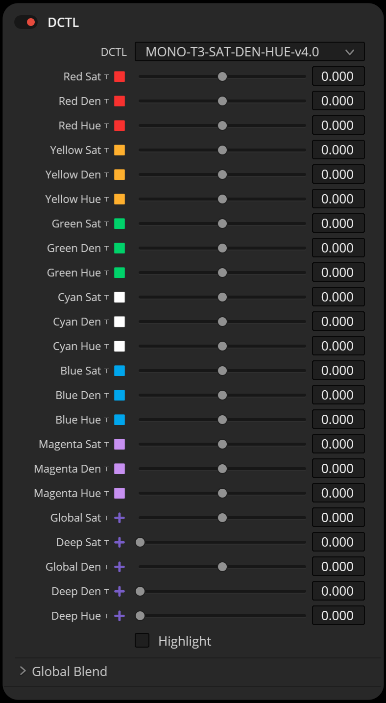
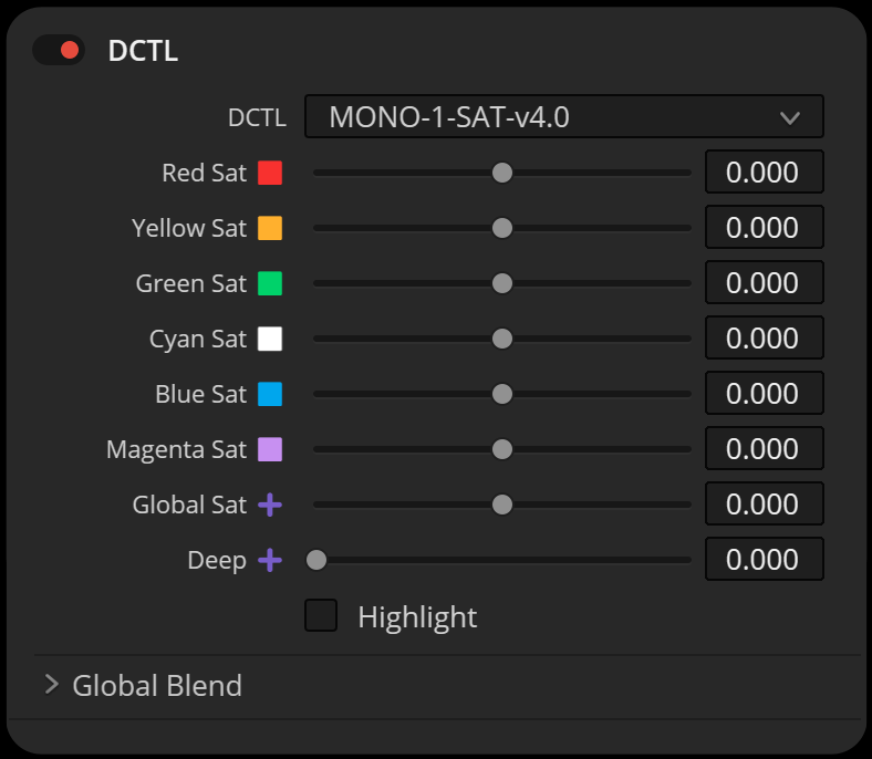
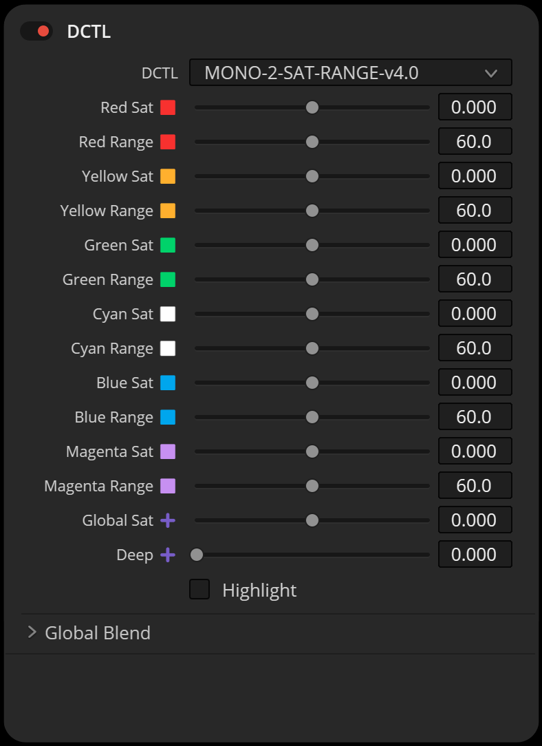
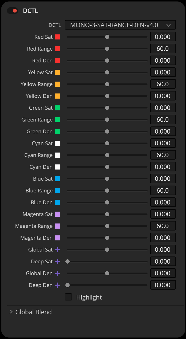
SAT DCTL
WITH HUE RANGE
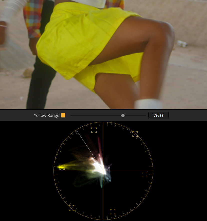
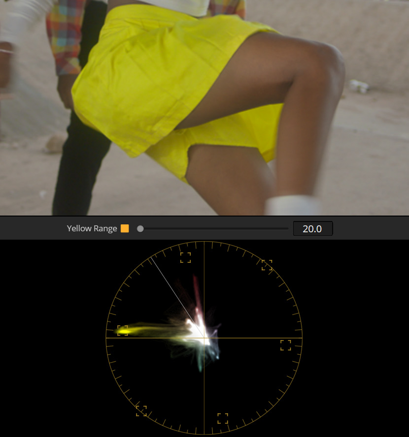
The Hue Range slider offers a balanced approach to hue adjustments. While the tool is designed for broad, natural shifts, the Range control allows you to fine-tune how far those changes reach into neighboring hues.
This is especially useful for colors like Yellow, which sit close to skin tones on the hue spectrum. With a narrower range, you can boost the saturation of something like a taxi or a bright yellow skirt—without affecting skin tones that fall between Red and Yellow. The adjustment remains soft and organic, but with just enough precision to keep creative intent in focus.
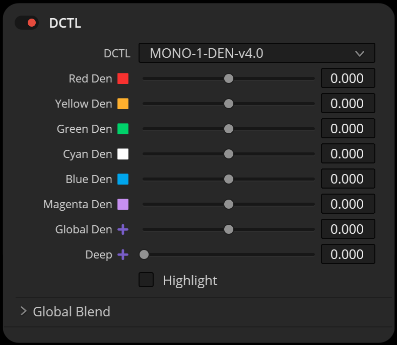
DENSITY
DCTL
“Density” reduces luminance, while saturation is subtractively increased to avoid greyish colors. This results in “film style colors” where colors appear deep and saturated. The results are very similar to the PowerGrade methods available in my “Film Emulation” package. The advantage of this DCTL is that we can apply density and intensity individually for red, green, blue, cyan, magenta and yellow.
Spherical vs. Tetra
One key difference between the models lies in how they handle Density adjustments. In the Spherical model, increasing Density primarily deepens the hue while keeping saturation levels relatively stable. This allows for more controlled tonal shifts without significantly altering the intensity of colors. On the other hand, the Tetra model links Density with slight saturation changes, resulting in a richer, more pronounced effect that gives colors a denser, thicker appearance.
REFERENCE
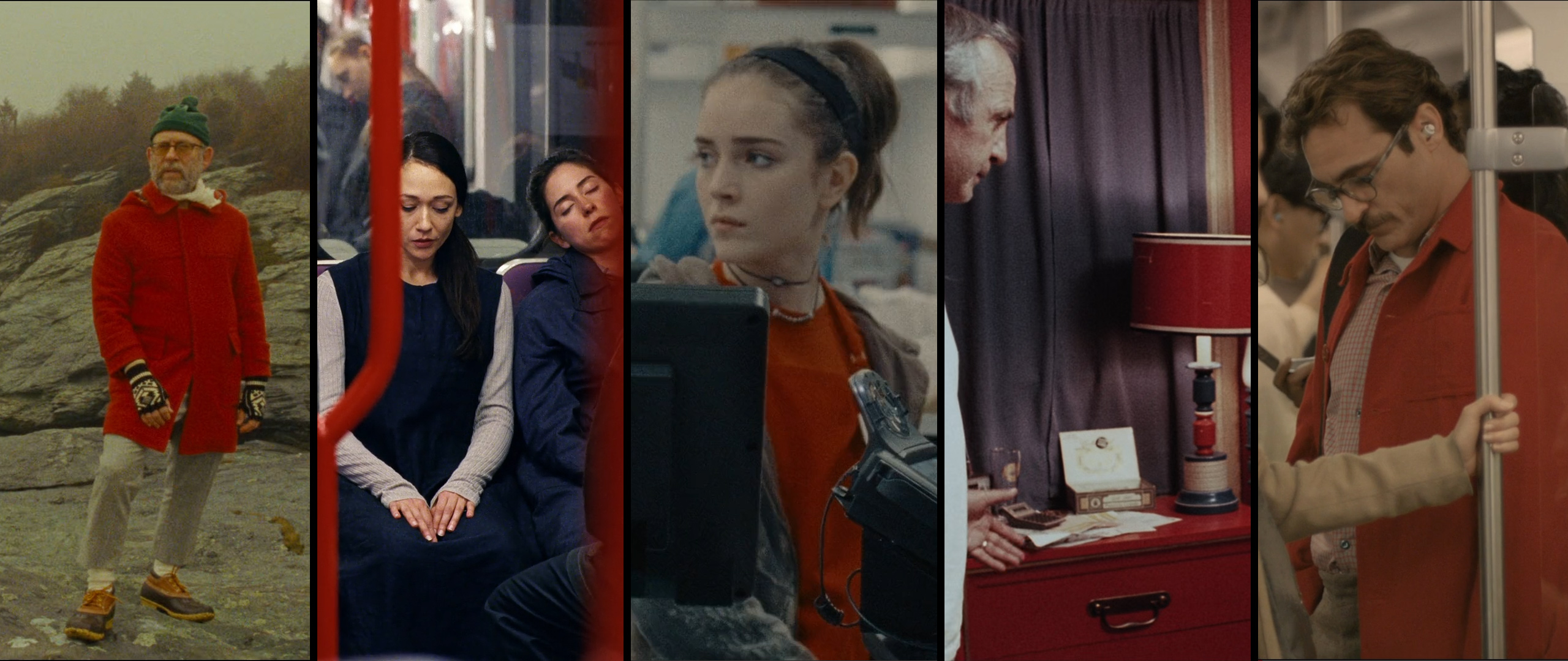
Moonrise Kingdom (2012)
Directed by Wes Anderson
© Focus Features
Anima (2019)
Directed by P. T. Anderson
© released for Netflix
Never Rarely Sometimes Always (2020) by Eliza Hittman / © Universal Pictures
Buffalo ’66 (1998)
Directed by Vincent Gallo
© Lions Gate Films
Her (2013)
Directed by Spike Jonze
© Warner Bros. Pictures
DENSITY DCTL


DEEP SLIDER
HIGHLIGHT MODE
The Deep slider has been refined with improved math to offer more precise tonal control. It adjusts how Saturation and Density are applied across the image, specifically by progressively excluding highlights as the slider value increases.
This means the higher the Deep setting, the more the adjustments focus on midtones and shadows—leaving highlight areas clean and unaffected. The slider itself doesn’t directly modify the image, but rather defines where in the tonal range your adjustments take effect.
With Highlight Mode enabled, you can clearly visualize which parts of the image are being excluded.
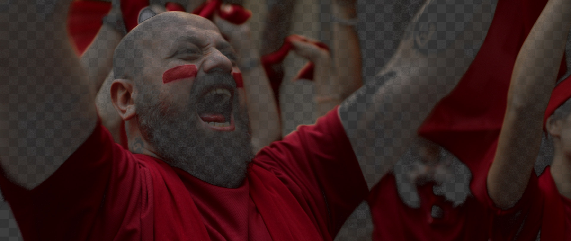


This image demonstrates the effects of adjusting only the skin saturation in ‘ColorSlice’. The steep transition towards red results in artifacts.
SKIN TONE ADJUSTMENTS
IN LOOK DEVELOPMENT
These DCTLs are primarily designed for global look development, prioritizing flexibility and creative freedom over precise corrections. Although Version 3.0 included a dedicated Skin slider inspired by tools like Color Slice, this approach proved somewhat limiting.
The Skin Tone Line serves as a reference rather than a strict target. Dedicated skin adjustments isolate skin tones, separating them from adjacent hues like reds and yellows, disrupting natural color interactions.
In Version 4.0, I’ve adopted a more holistic approach. Adjusting skin tones via the Red and Yellow vector controls naturally influences skin ranges without harsh separations, providing smoother transitions, cohesive color harmony, and a more intuitive grading experience.
INSTALL GUIDELINES
- Open the “Project Settings.”
- Go to “Color Management” and choose “Open LUT Folder.”
- Drag and drop the folders with the DCTL files into this directory.
- Restart DaVinci Resolve to apply the changes.

MONO DCTL Overview
| File Name | Model | Sliders per Hue |
|---|---|---|
| MONO-1-DEN-v4.0.dctle | Spherical | 1 |
| MONO-1-HUE-v4.0.dctle | Spherical | 1 |
| MONO-1-SAT-v4.0.dctle | Spherical | 1 |
| MONO-2-SAT-DEN-v4.0.dctle | Spherical | 2 |
| MONO-2-SAT-RANGE-v4.0.dctle | Spherical | 2 |
| MONO-3-SAT-DEN-HUE-v4.0.dctle | Spherical | 3 |
| MONO-3-SAT-RANGE-DEN-v4.0.dctle | Spherical | 3 |
| MONO-T1-DEN-v4.0.dctle | Tetrahedral | 1 |
| MONO-T1-HUE-v4.0.dctle | Tetrahedral | 1 |
| MONO-T1-SAT-v4.0.dctle | Tetrahedral | 1 |
| MONO-T2-SAT-DEN-v4.0.dctle | Tetrahedral | 2 |
| MONO-T3-SAT-DEN-HUE-v4.0.dctle | Tetrahedral | 3 |
WORKFLOW
NODE TREE ORDER
When using multiple DCTLs, it’s best to arrange them in series: start with Density, then Saturation, and finish with Hue. Whether to use Single, Double, or Triple DCTLs depends on your workflow.

COLOR SPACE
This color grading tool works well in large color spaces like DWG, ARRI LogC3, ACES, REDWideGamutRGB, Sony S-Gamut3.Cine, and other similar wide-gamut color spaces.
FREE DEMO VERSION
ko-fi.com / 1 MB
This version includes a watermark, displayed as a grid
of black plus signs on the image. The demo version is perfect
for users who want to explore the software’s features
and functionalities before making a purchase.

VIDEOS
COLOR SHIFT v4
YouTube: https://www.youtube.com/watch?v=YGgAqE58DVg
COLOR SHIFT v3
YouTube: https://www.youtube.com/watch?v=r9xPIZ_obHI
Vimeo: https://vimeo.com/945599897
COLOR SHIFT
FULL VERSION
One-time payment.
No subscription.
Free updates.
Format: Encrypted DCTL
MAIN FEATURES
Tetra and Non-T color models
Deep Slider for Saturation and Density
Hue Range Sliders
-
 € 199,00
incl. 19% VAT